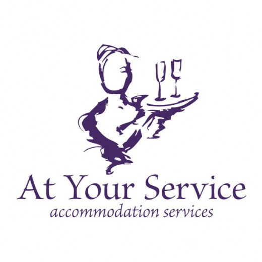
At Your Service Logo

Chris Cater had been successfully running her catering accommodation service company for over 20 years, but she decided it was time to update her image. She asked us to create a logo that conveyed elegance and artistry as well as help communicate the services that her company offers.
The final mark was built from a hand drawn sketch that Shea created. An illustration of a server with champagne flutes easily communicated the business provides waitstaff and bartenders, and the thick ink-like lines create a feeling of old-world elegance. The typeface was selected to compliment the line style of the drawing. The client was happy, stating that the image made her hear a party with the hum of conversation and clinking glasses.

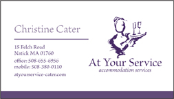
 The next step in the process was to create the all important marketing tool: the business card. We did nearly 12 separate concepts exploring the style elements suggested by the logo. We tried some elegant lacy textures and old world stain effects, but ultimately we felt the mark was strong enough to stand unadorned. A clean layout communicated all that it needed to, and a full bleed back added interest and sophistication.
Creation of a new At Your Service website was the next phase of this complete re-brand.
~shea & matt