At Your Service Website

This project is part of a larger re-brand initiative commissioned by At Your Service. They knew they wanted a fresh new image that projected their high quality, standards and panache. We had previously created a new Logo that featured a hand-drawn, artistic style and rich purple color.
This was the first website for At Your Service, so we were starting with a completely clean slate. We worked with the management team to figure out a sitemap and develop content. As At Your Service is a small company that prides itself on a personal touch, the scope of the site was kept simple while still providing all the information one would need to contact the company for a quote.
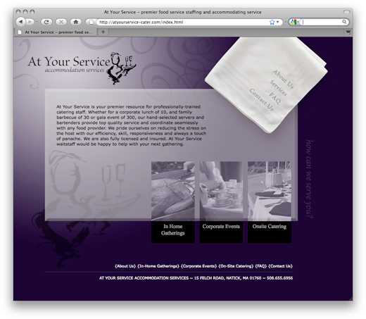
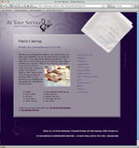
 We developed several possible visual directions with a wide range of aesthetics. Ultimately, this direction was chosen because of its “mood.” The client really liked the emotional response and sense of elegance created by the dark purple swirls and simple napkin graphic. The homepage features a simple roll over effect on key targets that creates just a touch of drama.
Overtime, as their collateral materials grow, the website will grow with the client. They will be adding to their image archive and posting more photography as it becomes available. The simple design allows the site to work visually now and as the content becomes more complex.
To learn more about At Your Service, please visit atyourservice-cater.com.
Programming and hosting provided by: Brattle Consulting Group.