Boston College Football Camp Brochure
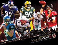
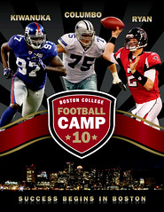
Matt has a particular love of sports-themed design projects, so we were very excited when Boston College asked us to quote on their annual Football Camp Brochure. Always a very intense photo-illustration project, the Camp Brochure needs to feature former BC players who have gone on to play in the NFL. We were tasked with brainstorming the theme statement for this year’s camp as well as creating a fresh, visual style for the piece to set it apart from the brochures of previous years.
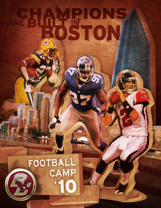
Our first step was to craft a theme statement that showcased the benefits of the BC Football Camp along with its host city of Boston. Previous statements have included “The Camp for Champions” and “The Road to Success Begins in Boston.” We liked using alliteration with Boston, and eventually landed on “Champions are Built in Boston” as our guiding theme.
|
Then we had to figure out how to interpret that visually. We came up with a number of visuals that had the “cool” factor we were looking for, but we also wanted to branch out a bit. So this is how a designer’s brain works: the word “built,” as in the act of building, kept bouncing around in Shea’s head. Going back to her youth, this conjured images of building blocks. This was too youthful a visual for this project, but she continued on the vein of toys and play. She thought about how “battle” is a common sports theme. Then the brain starts crunching in a weird designer way and “battle” gets added to “building blocks” and that turns into “toy army men.” But these couldn’t be your little brother’s toys, they had to be monolithic, like giant concrete cut-outs. And so the basis for our 3-D block football players was born.
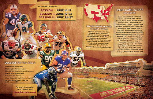
We mixed these bulky stone blocks with grungy, worn textures (kind of a nod to the “blood, sweat and tears” that is football), and arranged them in a odd 3-D space that created movement through the entire piece. The final photo collage for the interior spread was nearly a full Gb when we were done– gave the graphics processors something they could chew on that’s for sure.  In the end we had created a piece that allowed us to explore a new visual style and made us pretty happy. The client was pretty happy, too, and that makes it all the more rewarding.
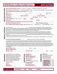
This project also had a companion piece that wasn’t as visually taxing, but extremely important to the actual running of the camp– the application. Form design is definitely viewed as one of the more unglamorous disciplines in graphic design. But a well-designed form can make all the difference for those who actually have to use it. A careful balancing act of text, space and graphic markers, this registration form makes it easy for both the one registering and the one processing said registration. By adding a few choice image elements from the brochure the form ties back nicely to the main marketing piece.
