BreakUp Coach Website (with Blog)
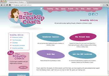
3thought worked closely with Dr. Sasha Carr to create the character and logo for her concept of “The BreakUp Coach.” The next step towards building the online community Dr. Carr envisioned was to design a website that would be the hub of all her future initiatives. The site needed to encompass her blog which she had already started on a separate platform, an advice column, e-mail based breakup counseling programs, and e-cards – and that was just the beginning.
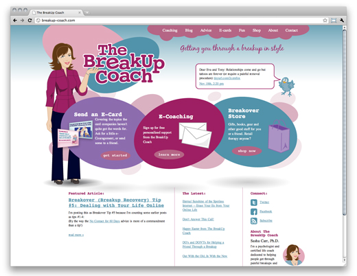
3thought set out to create something that married well with the original character design developed and capture the playful, “girly” spirit that Dr. Carr wanted to portray on the site. We wanted a bold statement on the homepage that guided visitors to key actions to take on the site: Send a Card, Sign-Up for E-mail and Shop for Merch. The secondary actions (reading the blog & advice columns) are displayed at the bottom of the layout with a feature article and links to recent posts. The bold “jell bean” shapes carry throughout the site and create a casual, playful feeling.
The site was coded by TG Web Development, utilizing a custom CMS they developed just for this site. This allows each function to remain distinct and easily maintained by the client herself. We were able to import the BreakUp Coach’s previous blog articles so that the blog portion of the site would be fully populated at launch.  We also build an article categorization system that would automatically update a grid of “jelly bean” navigation buttons. Further, we build an e-mail system that registers users and sends them personalized messages built off of a pre-determined curriculum of breakup advice.
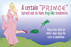
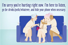
Perhaps our favorite feature of the site involves the e-cards.
Here, we were able to let our inner-artist loose, creating custom illustrations for each card.
As not-fun as the end of the relationships are, we are sure that the breakup-coach.com website will bring a smile to a few faces.


