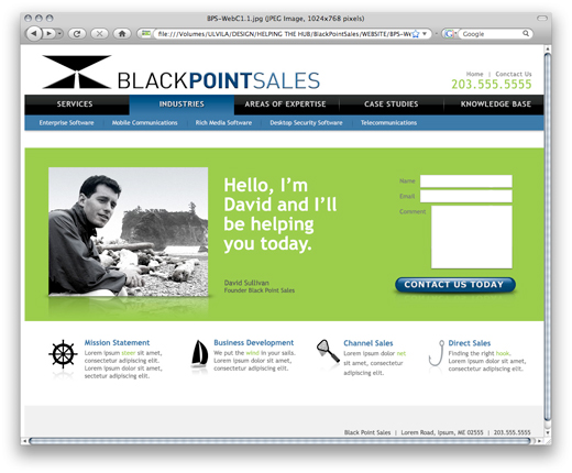
Black Point Sales Website & Logo (for Helping the Hub)
 Ok, well, it’s not up and running yet, but it’s close. Last week we completed the design phase of the website for Black Point Sales. Now it’s in the hands of the developers and I’d expect to see it up and running within a few weeks. This was the first official project that 3thought completed for Helping the Hub. Those of you who don’t know what Helping the Hub is, feel free to check it out its mission.

Along with the homepage, we also created a logo for Black Point Sales. We presented the logos (seen here on the left) and the client was originally interested in a more illustrative version. He eventually settled on the 5th concept down with some typography adjustments. All the concepts were created in black and white, and we never did a full color study. With the name “Black” Point Sales, we thought keeping to a black and white palette would (A) Keep project costs lower and (B) Tie right in with the company name. Mission accomplished.
The next phase of the project was to build a site template that presented a friendly and approachable yet still professional image. The blue was selected for a sense of stability and the green to add energy and a feeling of progressiveness. Nautical icons were created to highlight the key services.
If you’re a small company or a non-profit, and you’re looking for a hand with your website feel free to give Shea or myself a call. We love working with start ups. We know what it’s like to be starting out and we’re always willing to work with-in a budget. We also realize that we might not always the best fit for your companies needs, and refer folks to the Helping the Hub Team or some of our other strategic partners. At the end of the day, we want what best for you. So, that’s the story of Black Point Sales and another succesfull project for Helping the Hub. Check back with us soon and we’ll post a link as soon as the site goes live.

Final Logo for Black Point Sales