
Modernizing a High-Visibility Brand Built on Tradition
Case Study
Education
Brand Identity Systems
Massachusetts Maritime Academy didn’t have a recognition problem. It had a consistency problem.
Across campus, departments, athletics, clubs, and alumni were creating whatever they needed—with inconsistent logos, colors, typefaces, and spin-offs. A previous rebrand had introduced new pieces, but not a reliable system for using them. The academy looked different depending on who was speaking.
With a highly visible brand, deeply held traditions, and stakeholders who cared intensely about its symbols, MMA couldn’t simply make a clean break. It needed a modern identity that still felt unmistakably Maritime—and a system people across campus could actually use.
Deliverables
What began in 2022 as a request for custom academic iconography quickly exposed a larger need. The work expanded into a complete institutional and athletics identity system spanning the Maritime M, formal seal, athletics marks, mascot, pride marks, color, typography, templates, and a living set of Visual Branding Guidelines.
The system was built for real users working in Adobe, Canva, Word, print production, merchandise, and digital marketing—not just designers working under ideal conditions.
Results
The new identity began rolling out in spring 2024 and became increasingly visible across campus that fall.
MMA gained a consistent, professional brand that could support admissions, development, athletics, campus organizations, merchandise, signage, campaigns, and international events. Internal teams gained clear rules and usable assets, while 3thought remained involved as an extension of the marketing team—setting seasonal creative direction and stepping in when additional ideas or production support were needed.
The response was overwhelmingly positive. Today, the new identity appears across campus as a shared source of pride.
Scope of Work:
Brand Architecture & Governance
Yearly Campaign/Themes
Custom Iconography
Visual Branding Guidelines
The work couldn’t begin with a dramatic reveal. It had to begin by understanding where the existing identity was failing—and which parts people were unwilling to lose.
The Project Started With Icons. The Work Didn’t.
3thought’s first quote was deceptively specific: create a family of icons representing MMA’s academic majors.
But the icons weren’t the first thing executed.
Early meetings raised larger questions about how the identity was being used, where it was breaking down, and why the existing standards weren’t working. MMA already knew the brand had become difficult to control. Different departments had different needs, and without usable guidance or accessible files, people improvised.
Two pain points surfaced immediately. The academy’s blue rarely reproduced consistently, and its athletics mascot no longer represented the institution it was supposed to rally.
Before adding more pieces to the identity, the foundation needed to work.
At the same time, the brand carried real equity. Alumni and trustees cared deeply about its colors, symbols, and traditions. Earlier changes—particularly the removal of the ship’s wheel from the formal seal—had created lasting frustration.
The challenge wasn’t simply to make MMA look newer. It was to improve the identity without disconnecting it from the people who already considered it theirs.
A focused team representing marketing, athletics, and academy leadership gave 3thought room to follow the real problems. With the right people working toward the same goal, a potentially unwieldy institutional rebrand became a coordinated effort to make the brand work better for everyone.
The first breakthrough didn’t come from a new logo. It came from solving a color problem everyone at MMA already knew too well.
The Breakthrough Was Color
The academy’s existing blue had an unfortunate habit of turning purple.
It was one of MMA’s biggest frustrations with the previous standards.
That and the yellow could also become overly bright, creating formal materials that felt disconnected from the disciplined, maritime character of the institution.
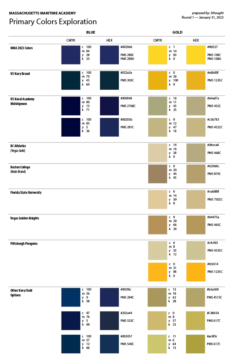
Choosing better-looking colors on a screen wouldn’t solve the problem. They had to reproduce reliably in the real world.
3thought coordinated with as many of MMA’s vendors as possible to produce physical samples across a range of blues and golds. Proofs from campus printers, local print vendors, commercial production partners, and others were compared to find the combination that remained most consistent from one application to the next.
A navy that reproduced consistently and a new Vegas gold were then defined across Pantone, CMYK, RGB, HEX, and digital applications.
For the MMA team, the test-printing process was a breakthrough. No one had previously suggested evaluating the palette across vendors this way, yet it made immediate practical sense.
That type of thinking demonstrated what the larger engagement could become: less bluster about a dramatic new design and more attention to how a brand actually performs once it leaves the studio.
Because consistency earns trust.
With the palette grounded in the real world, MMA was ready to confront the identity’s most visible—and most sensitive—problem.
The Captain Showed What Was Possible
With colors locked in, the first new design element delivered was the athletics mascot.
The old buccaneer had become a significant pain point. The bearded pirate leaned heavily into stereotypes and no longer represented MMA’s changing student body or the full athletics community.
The academy didn’t need or want to abandon the Buccaneer identity. It just needed a better Buccaneer.
Working with athletics leadership, the Captain was developed to feel strong, modern, and representative of every team. The simplified character preserved the academy’s competitive spirit without falling back on the caricature of a hairy pirate brandishing a saber.
The Captain gave campus stakeholders an example of what a more thoughtful identity could do. It respected the institution while making room for more people to see themselves in it.
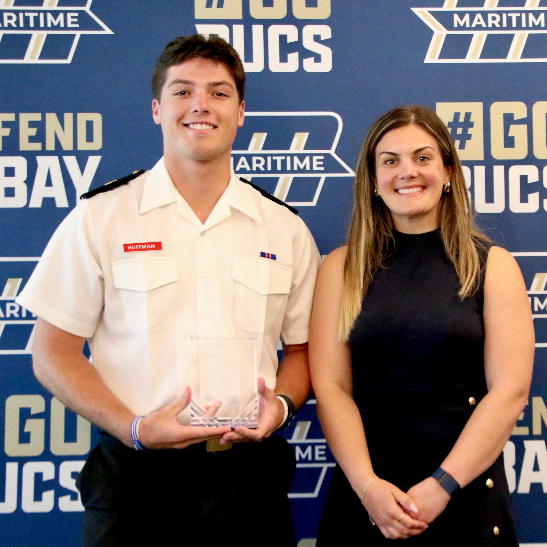
A complete athletics system followed: BUCS and Buccaneers wordmarks, athletics typefaces, alternate marks, uniform guidance, and an athletics M designed to work reliably on navy, gold, or white.
Small details like including a stronger outline around the Athletics M design made the mark easy to use on multiple backgrounds, allowing staff members ordering uniforms or producing recruiting materials to use one dependable mark rather than identifying the correct color reversal for every application.
The system also formalized campus rallying cries including “Defend the Bay” and “Go Bucs.”
These weren’t slogans invented in a branding meeting. They were already part of campus life. The new identity simply gave students and teams a consistent way to claim them as their own.
The athletics work proved that the identity could change without losing its character. That trust brought the project back to the smaller assignment that had started it all.







Returning to the Original Assignment
With the larger identity taking shape, 3thought's work returned to the major icons that had started the conversation.
Inspired by formal insignia and used on items as small as pins, each school icon needed to remain recognizable at reduced sizes while working across clothing and marketing materials.
The final system included one-color, two-color, full-color, and dimensional versions—giving MMA practical options without sacrificing consistency.
What began as a request for seven major icons transformed into an entire family of unique marks that eventually turned into a complete redesign of all of the iconography used in marketing and displayed across campus.

Once the major pieces were taking shape, smaller inconsistencies became easier—and more important—to see.
Polishing What Already Worked.
Some of the most consequential changes were also the least obvious.

When we went back to reproduce the existing Maritime M, we found several small inconsistencies that affected how the mark performed at different sizes. At smaller sizes, tight shadow spacing created thin lines that blurred together at the pixel level. At larger sizes, slight inconsistencies in the angles became much more noticeable.
The interior typography also no longer related to the new brand system, particularly the angled forms and visual language we were establishing elsewhere.
Rather than redesigning the Academy M, we refined it. We corrected the geometry, standardized the shadow spacing, and adjusted the typography so the mark reproduced more consistently and felt like part of the same system.
For Athletics, we created new alternate M marks inspired by the original. The goal wasn’t to introduce another visual system, but to give Athletics more flexibility while keeping everything clearly connected to the Academy brand.
The changes are subtle. The point wasn’t to reinvent the M, but to refine the last 10% and build from it more intentionally.
“Fonts, colors, spacing, geometry — these are exactly the kinds of changes designers get dragged for online. We know it. They can look minor from the outside. But when you’re responsible for a brand system that has to work everywhere, those details matter. Small inconsistencies compound. Over time, they erode trust. Fixing them matters.”
The Maritime M required precision. The academy’s formal seal required something more difficult: deciding which traditions needed to survive.
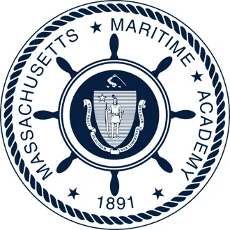
Legacy Seal - With ship's wheel
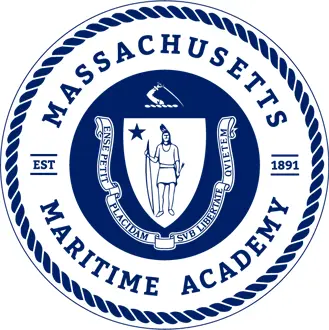
Simplified Seal - 2019-2024
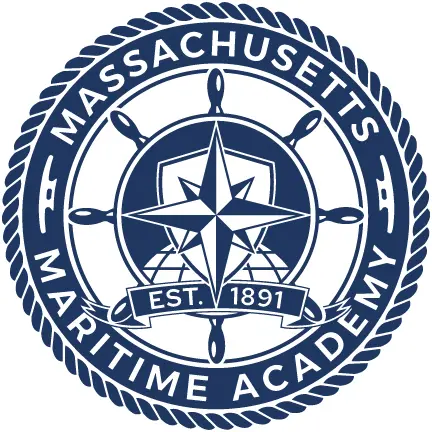
Updated Seal - With ship's wheel 2024-Present
Modernizing Tradition Without Erasing It
At an institution shaped by maritime and military-like traditions, symbols aren’t decoration. Symbols carry history, identity, and pride.
One symbol mattered more than most: the ship’s wheel. It had played a prominent role in MMA’s legacy seal before being removed during an earlier rebrand. Alumni had made their feelings clear. The wheel needed to come back.
Redesigning the academy’s formal seal required particular care. Because this was MMA’s highest-level institutional mark, leadership and trustees had more at stake—and more to say. At the same time, the Massachusetts state seal and its depiction of Massasoit needed to be removed. The new design had to satisfy that requirement while rebuilding trust after a symbol alumni valued had already been taken away.
The assignment wasn’t to recreate the old seal. It was to restore what mattered and give every remaining element a reason to be there.
The ship’s wheel returned. A compass rose represented direction. A globe reflected the academy’s international reach. Rope, cleats, and other nautical details grounded the mark in its maritime identity.
Good design depends as much on what gets left out as what gets included. By resisting the urge to fit every possible idea into the seal, the final mark feels intentional, enduring, and worthy of the institution it represents.
Brand Guidelines People Can Use
The Visual Branding Guidelines rolled out across campus thoughout 2024. They weren’t created simply to document the rebrand. They were built to settle the everyday questions that had allowed the previous identity to become inconsistent.
Which logos are current? Who can create a departmental or event mark? What requires approval? When is a trademark symbol necessary? What changes between merchandise and an internal document? How should a non-designer use an approved Canva template?
The guidelines distinguish the institutional and athletics systems, define how the marks work together, identify retired assets, and give departments clear boundaries for creating new materials.
They also continue to evolve. As new needs emerged—from “Learn. Do. Lead.” to flags and challenge coins—the guidelines grew with them.
The goal was never for 3thought to design everything MMA produces. Internal teams lead much of the academy’s day-to-day marketing and athletics work. The system gives them the structure and assets to move confidently, while 3thought continues to provide seasonal creative direction and additional support when needed.
Employees can access the guidelines and approved files online or through the academy’s internal systems. A small group of brand stewards now has an objective standard for evaluating new work.
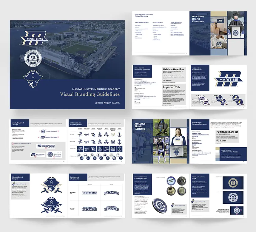
Consistency no longer depends on personal opinion.
A system this extensive would ultimately be judged less by its launch than by what happened after people across campus began using it.
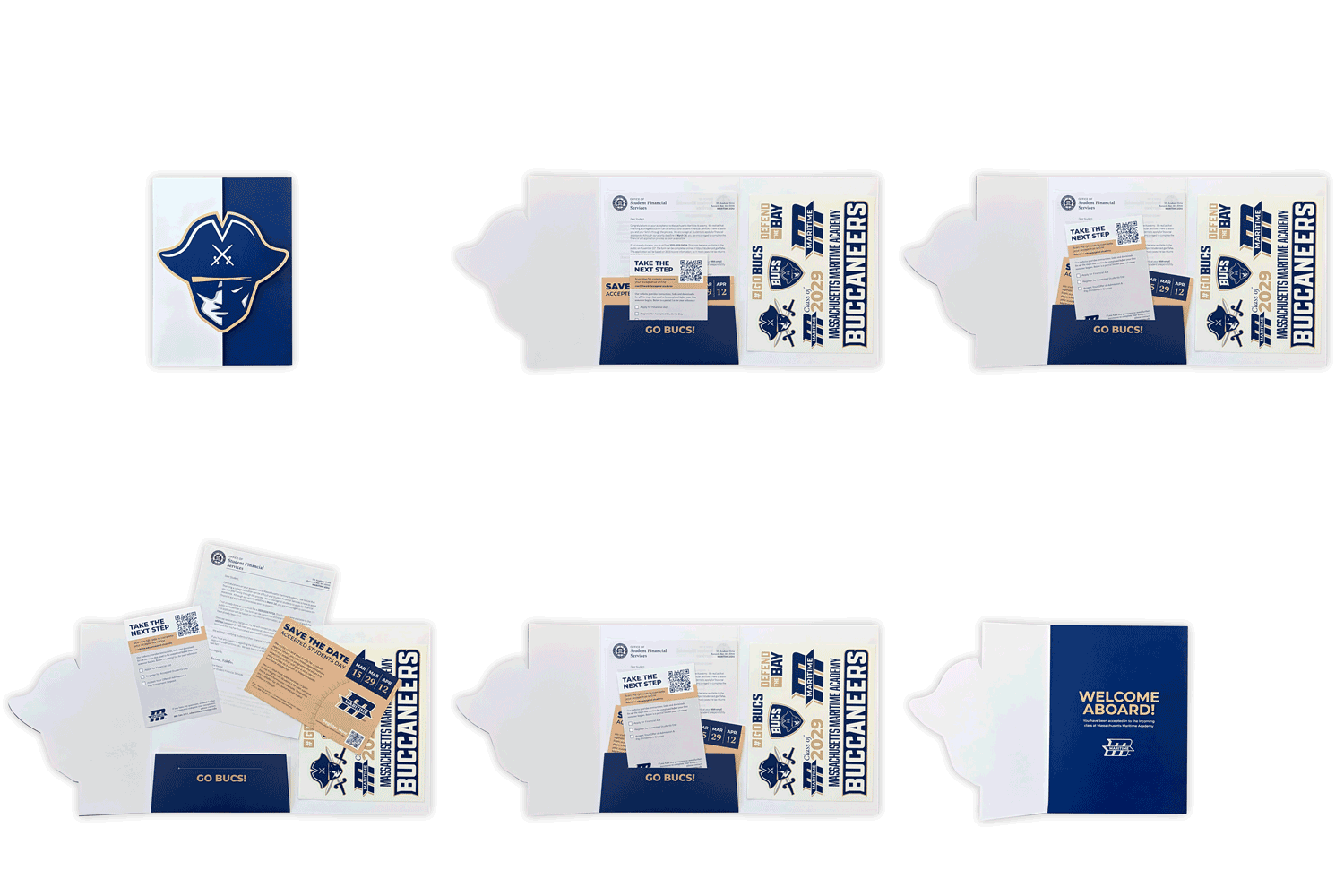
A Quiet Rollout. A Visible Result.
The launch was intentionally gradual. After the response to previous brand changes, the people closest to the project were prepared for alumni resistance.
The feared backlash never arrived.
One of the identity’s first major applications came in fall 2024, when MMA hosted IAMU/AGA 24. 3thought created the event theme and graphics suite, helping the academy present a cohesive, professional identity to an international audience.
As the rollout continued over the following years, the new marks appeared on uniforms, courts, fields, lockers, vehicles, banners, merchandise, dorm-room flags, and admissions materials. Students, staff, alumni, and campus leaders consistently described the new identity as an improvement.
There was no single reveal that defined the project. The proof came through adoption.
When the planning, design, and execution are done well, much of the reward is that the work goes unnoticed.
Sometimes we hear about it later, when someone recommends the work to a colleague or calls us from their next organization.
But the real joy comes from knowing we built a system that works.
That may sound anticlimactic. It is also the point.
For high-visibility organizations, a successful rebrand isn’t only about how the identity looks on launch day. It is about how well it continues to work after it leaves your hands.
Massachusetts Maritime Academy now has a brand built to do exactly that.