Schernecker Property Services Website
One of the favorite tasks we take on at 3thought is building out a brand aesthetic across all mediums. Schernecker Property Services (SPS) had begun the process of modernizing their brand elements with a corporate brochure and a series of mailers. However, their online presence was falling behind these efforts by an ever increasing margin. It was time for a redesign.
SPS has long partnered with Clarity Communications to help them keep their marketing on target. Clarity Communications contracted with 3thought to help bring the new visual and message directions of SPS’s marketing to the web.

Before
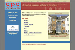
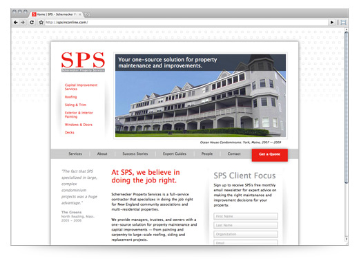
The previous site had a very dated design aesthetic that did not merge well with the new crisp white marketing materials. The new site needed to show as a best of class for SPS’s market, as well as offer more sales drivers and easier maintenance. We presented a few options and SPS selected an option that showcased a large homepage photo slider and a very open, clean template.
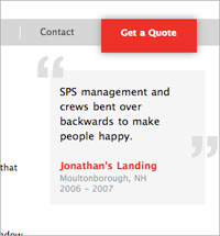
 The design was kept honest without clutter, but did offer select details to keep things interesting. An example of this would be the testimonial style featured on most pages – a CSS treatment that creates interest without being overly “loud.” We also paid careful attention to application of red throughout the design make sure to draw appropriate attention to key messages and calls to action.
A very important marketing tool built into the site are the Expert Guides. SPS uses these highly targeted white papers to establish their position as the experts in their field. The form to request these guides can be accessed from several points throughout the site. The check box options expose users to variety of information available and encourage them to request additional information.
The site is built on an uncomplicated CMS that allows administrators to easily add subpages and rearrange key elements. Watch for a review of this CMS by Lucas Wojciechowski coming soon.
3thought also created PDF templates and layouts to showcase the in-depth case studies (Success Stories) and Expert “Do It Right” Guides. Each need to fit within the same brand system but stand as individual categories of materials.
Thank you to Ethan at Clarity Communications for his guiding hand throughout the project and to the entire SPS team. It was a great experience to work with everyone.
