3 thoughts for the week of March 8, 2010 (naptime, easy to read = easy to do, & pick 5 typefaces)
March 10, 2010//Last Updated January 6, 2013

- There’s a little known fact that Shea had to give a speech at her high school graduation. She was terrified, but decided it was a great opportunity to speak her mind. Instead of sticking to the traditional “it’s only the beginning” or “look back on fond memories as our dreams take flight” themes, she elected to devote her entire speech to NAPTIME. Why? Because naptime has been relegated as something only necessary for the very young, who in this fast-paced world are actually some of the least stressed on the planet. At times when we’re under pressure and mentally taxed (like finishing high-school or any given work day for a designer), we need to take a moment to relax, breath and mentally recharge. A nap is the perfect remedy. And science agrees. A recent article on biznik (great blog BTW) talked about how many Japanese companies are now promoting afternoon naps for their employees. And productivity is up. Yay! Now when will U.S. companies make this a standard practice?Read the full article: Afternoon Nap is the New Trend in Productivity?
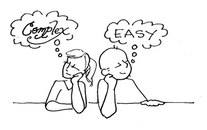
- Type choice is a crucial in any design. Designers can pour over hundreds of fonts before selecting just the right one – the one that provides all the supporting connotations a complete design needs. Sometimes it’s hard to fight against the desire to use a new font because it’s new, because it’s “shiny,” because it’s just soooo cool. But the choice of typeface can affect more than just the style or feeling of a piece. It affects more than the viewer’s ability to understand. It actually affects the viewer’s willingness to understand it and believe it. A recent study showed that a simple font was more likely to convince the reader to make a commitment. When subjects were shown a written exercise routine, they estimated the routine would take almost twice as long to complete when it was written in Brush Script as opposed to when it was written Arial. Definitely food for thought when creating a layout designed to convert rather than just look pretty.

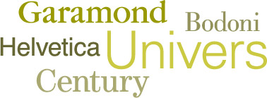
- Design legend Massimo Vignelli is famous for declaring he only needed to work with 5 typefaces: Garamond, Bodoni, Helvetica, Univers, Century. Now many have disagreed. And font hounds that we are, we sure would find it a difficult restriction to stick to when there are so many expressive options out there. The idea, however, that a skilled designer doesn’t need trends and flashiness to create an effective, compelling design is one that rings true. So designers, we challenge you, if you had to pick just 5 typefaces to work with for the rest of your career, what would they be? We’ll publish our picks in a later post along with some of your top 5 lists.
Posted in 3 Thoughts, Blog