3 thoughts for the week of May 3, 2010 (what inspired Matt Ulvila)
Last week we took a look at 3 designs that inspired Shea Baker. This week it’s Matt Ulvila’s turn to talk about what inspired him to become the designer he is today.
3 of Matt’s Design inspirations

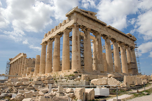
1. The Parthenon by Iktinos, Kallikrates and Phidias
It’s difficult to believe that a 2,500 year old building would change the way I design today, but it did. It was first semester of Sophomore year at KSC, and I was taking Art History 101 with Dr. Friedman. It couldn’t have been more than a few classes in, when we learned about the Parthenon and how it was created using the proportions of the golden rule. Dr Friedman is a passionate guy… More an art preacher than an art teacher in a lot of ways. I was fascinated to learn that there’s a formula for beauty. I thought “it couldn’t be possible”… and “this guy is off his rocker”… But, I kept listening and learning, and it turns out that there is a magic formula, and it occurs all the time in nature. Wouldn’t you know that some of the greatest pieces of art ever, use proportions similar to this golden ratio, golden rule, divine proportion (whatever you choose to call it). From that point forward and to this very day, I use the golden ratio in my designs. Not to say it’s the end all be all for great design, but it’s a fun element to work with.
To learn more about the golden ration check out this video on YouTube.
– – – – – – – – – – – – – – – – – – – – – – – – – – – – – – – – – – – – – – – – – – – – – – – – – –

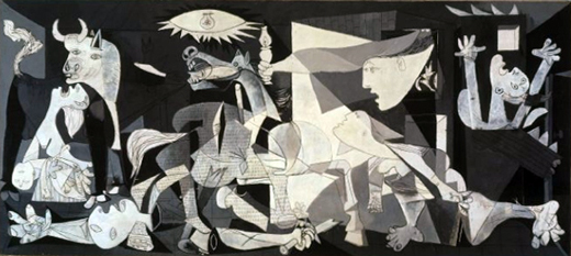
2. Guernica by Pablo Picasso
In the Fall of 2001 I took another class with Dr. Friedman. This time it was 19th and 20th Century Art. On the third day of class that semester, the September 11th attacks took place. Everyone’s world changed instantly. As the semester went on, we learned about a painting by Pablo Picasso called Guernica. It’s Picasso’s interpretation of the bombing of the small Basque town during the second World War. It’s a snapshot of his life, and how he was feeling about this tragedy. Through his artwork, we learn about the innocent people who where killed that day, and how lives of the people who survived changed in a similar way to what we had all just experienced. It really made an impact on me. Picasso used his painting to tell the story of Guernica, and the painting remains a great anti-war symbol. Great design in my opinion is always about telling a story.
– – – – – – – – – – – – – – – – – – – – – – – – – – – – – – – – – – – – – – – – – – – – – – – – – –

3. Ogden Plumbing logo by Astuteo
Nothing much to say here except… Best use of negative space ever!!! OK, if you know me, you know I’m a sucker for “A ha” moments. I love em in books, movies and especially in graphic design. This logo for Ogden Plumbing is far and away one of my favorite logos. It’s simple. It’s complex. Dare we say… it’s “simplex”? Whatever you wanna call it, there’s no doubt it’s pretty awesome. Creating something that’s memorable like this logo is what every passionate designer strives for on every project.
For more great negative space logos, check out a great post by David Airey at logodesignlove.com
– – – – – – – – – – – – – – – – – – – – – – – – – – – – – – – – – – – – – – – – – – – – – – – – – –
Now that Shea and I have shared a few things that inspired and influenced us, our question to YOU OUR READER is: What inspired you? Whether you’re a pixel pusher, fry flipper, desk jockey or a social media “expert”. What inspired you to become the person you are today?
Comments are always appreciated and we’d love to hear from you.